The Pink House
Homemade reasons to gather together
“The Pink House” in historic Belvedere Mansion is a jewel in the crown of Claremore, Oklahoma.
Shari Beguin, entrepreneur and co-owner of The Pink House, has spent the last fifteen years making her mother’s dream of owning a teahouse a reality.
“When we bought The Pink House in 2007, my Mom's original vision was to be able to have "teas" (like British style high teas) and a place where people could come to relax, connect with family and friends, and leave feeling more peace. We found out that you can't make a living just having "teas" (at least not in Claremore), so we had to alter our plans to include a busy restaurant, catering many events, and adding a gift shop most recently.
Our goal, and perhaps our calling, is to invite people into our restaurant like it is our home, feed them well, serve them well, and let them connect with each other.”
The Pink House got its name from its original location: a pink house.
The original Pink House sadly fell into disrepair, but Shari and crew were delighted to have the opportunity to move into the historic Belvidere Mansion in 2017.
The Goal and The Discovery
Every brand design with Biaka Works begins with the crucial Discovery Phase. We walk you through our Brand Discovery Questionnaire to unearth the heart of your brand, clarifying how you meet your customer’s most basic need and stand out from your competitors.
Shari wanted The Pink House’s new branding to bring consistency to every Pink House destination experience. “Our location in the Belvidere off Route-66 makes us more than just a restaurant. It’s more like a destination that people from all over the state would drive to visit.”
When guests arrive from far and wide to enjoy a delicious homemade meal, attend an event hosted or catered by the Pink House, or shop in their boutique gift shop, Shari wants them to be greeted with an experience that could be described as, “Warm, happy, peaceful, delicious, different, healthy, decadent, and homemade.” It was important to Shari that their online presence be marked by these feelings, too.
When asked to describe her business form a 30,000 foot perspective, Shari took the opportunity to share her heart for creating a happy workplace.
“Another aspect to our business is taking care of our employees. I feel like I am called to love the next generation and provide a place for them to work while in school and help them grow as leaders and send them out hopefully better prepared for the "real" world. In taking care of our employees and fostering a warm, happy work atmosphere, I feel like this is then passed on to our customers. All that being said, we have to make money to accomplish any of these things. That is one reason we added a gift shop recently so we could increase our margin and also provide unique gifts.”
The Design
Our Lead Designer, Avery, was instantly inspired after meeting Shari and understanding her brand’s needs. Avery knew that The Pink House’s branding would need to live up to the reputation and warmth that Shari and her family worked so hard to create.
“You can tell right away when you meet someone and are confident they are doing what they were made to do. Shari is one of those people. Her passion for her business, her family, and her employees that she treats like family was evident in every conversation. I set out to design a brand that was marked by this warmth and generational charm, with hints of nostalgia and whimsy.”
THE BRAND
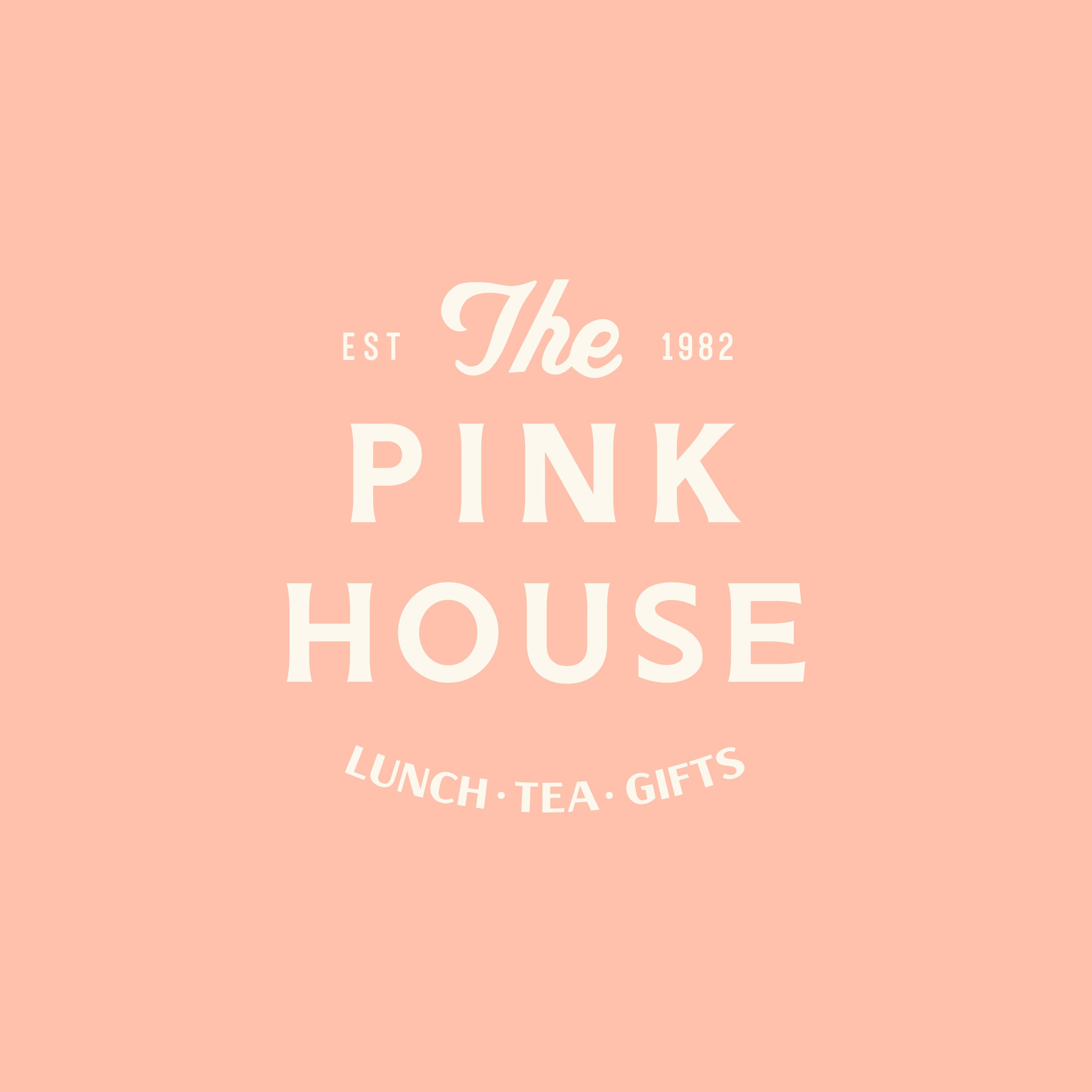
The main logo for The Pink House was inspired by antique tea tins and classic general store label typography. Avery created custom hand lettering for “the”, and paired it with a timeless sans serif font that would balance the floral illustrations.
Before and After of The Pink House’s logo
The addition of tagline “Lunch + Tea + Gifts” was included to inform potential customers of a few things the Pink House has to offer. The lighter pink was chosen to appeal to younger generations, while also nodding to vintage color palettes. The best of all generations!
Biaka Works specializes in strong color palettes, and Lead Designer, Avery, meticulously chooses each color in a palette to ensure they complement one another perfectly. The beauty of a strong color palette is versatility, giving you the ability to mix and match colors with confidence.
Avery enjoys drawing color inspiration from the details that make a brand or a business unique. The Pink House’s color palette is nostalgic and warm, much like their location and business offerings. The names in the color palette are inspired by things you’ll discover when you experience The Pink House, like delicate porcelain drinkware, smooth honey for your tea, or stately Belvidere Brick.
The main brand pattern was inspired by the antique tile located in The Pink House’s lobby. The classic hexagon style is rejuvenated with the antique blue and emerald palette.
Avery translated this tile pattern from the lobby into one of the brand patterns for The Pink House, providing consistency between in-person and online experiences.
The second brand pattern was inspired by Oklahoma State’s flora and fauna.
Avery designed the pattern with the Oklahoma Rose, Mistletoe, and Redbud as the stars of the show. These are Oklahoma’s (conveniently pink!) state flowers.
Belvidere the Bird
An eleventh-hour addition, the Scissor-tailed Flycatcher illustration became a charming addition to The Pink House branding. Avery thought he deserved a name, and “Belvidere” seemed fitting for The Pink House’s mascot.
Thank you, Shari, for partnering with Biaka Works to create a brand that will hopefully carry The Pink House into the next thirty years of success. You’ve created a company that blesses everyone it touches, whether through a wholesome meal or through an employment experience marked by grace and intentional care. You are one of a kind, and it’s a privilege to be on The Pink House’s team!
-With so much Love, the Biaka Works team
Is your current (or lack of) branding serving your organization to the fullest? Does your nonprofit organization, business, or ministry need a custom brand identity to increase your influence in your community? We would love to partner with you to advance your mission and empower your work for good.
This project is an example of our custom brand identity experience, “The Works”. You can read more about “The Works” experience by clicking the button below.
Ready to book your project, or just have questions to see if Biaka Works would be a good fit? Click the button below to start the conversation!


